Art Director
Designer
Paul Bailes
Client
Pool Reinsurance
Date
September 2019
Deliverables
Brand Foundations
Brand Identity
Print Design
Digital Design
Brief
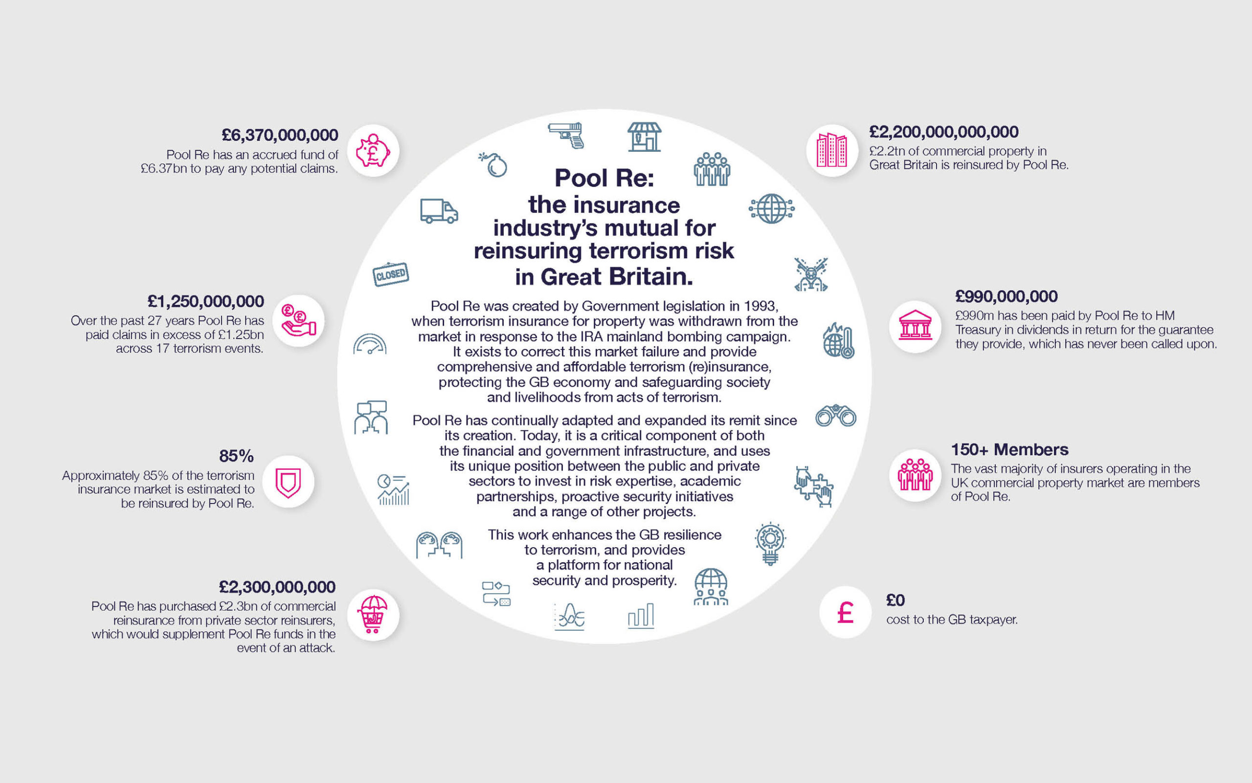
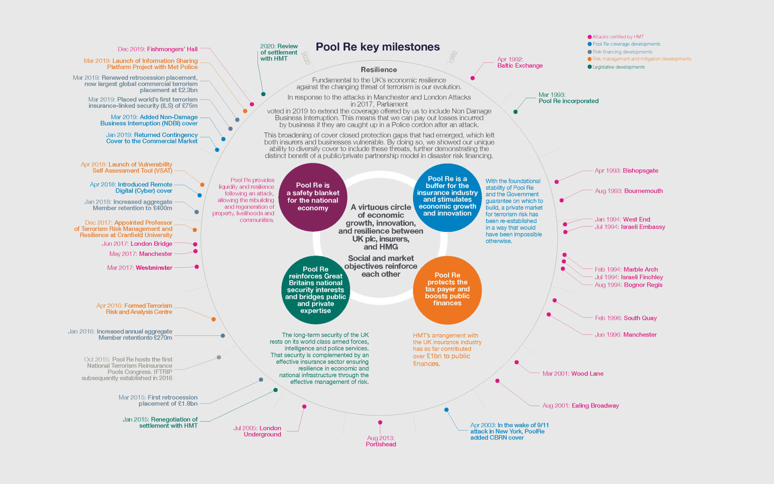
Pool Re is the insurance industry’s mutual for insuring terrorism risk in Great Britain. Established in 1993 by the UK Government in response to the untenable losses and uncertainty caused by the Provisional IRA’s devastating bombings in financial centres in London and Manchester during The Troubles.
Pool Re exists to correct market failure, protect the UK economy, and safeguard society and livelihoods from acts of terrorism. It provides a financial safety net for around £2.2 trillion of assets and businesses of all sizes.
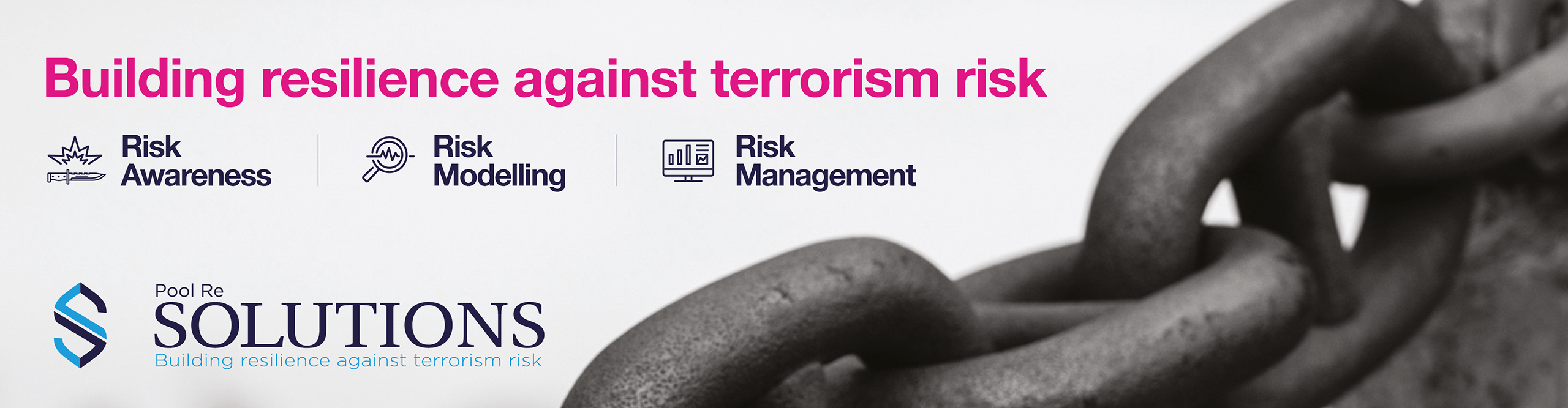
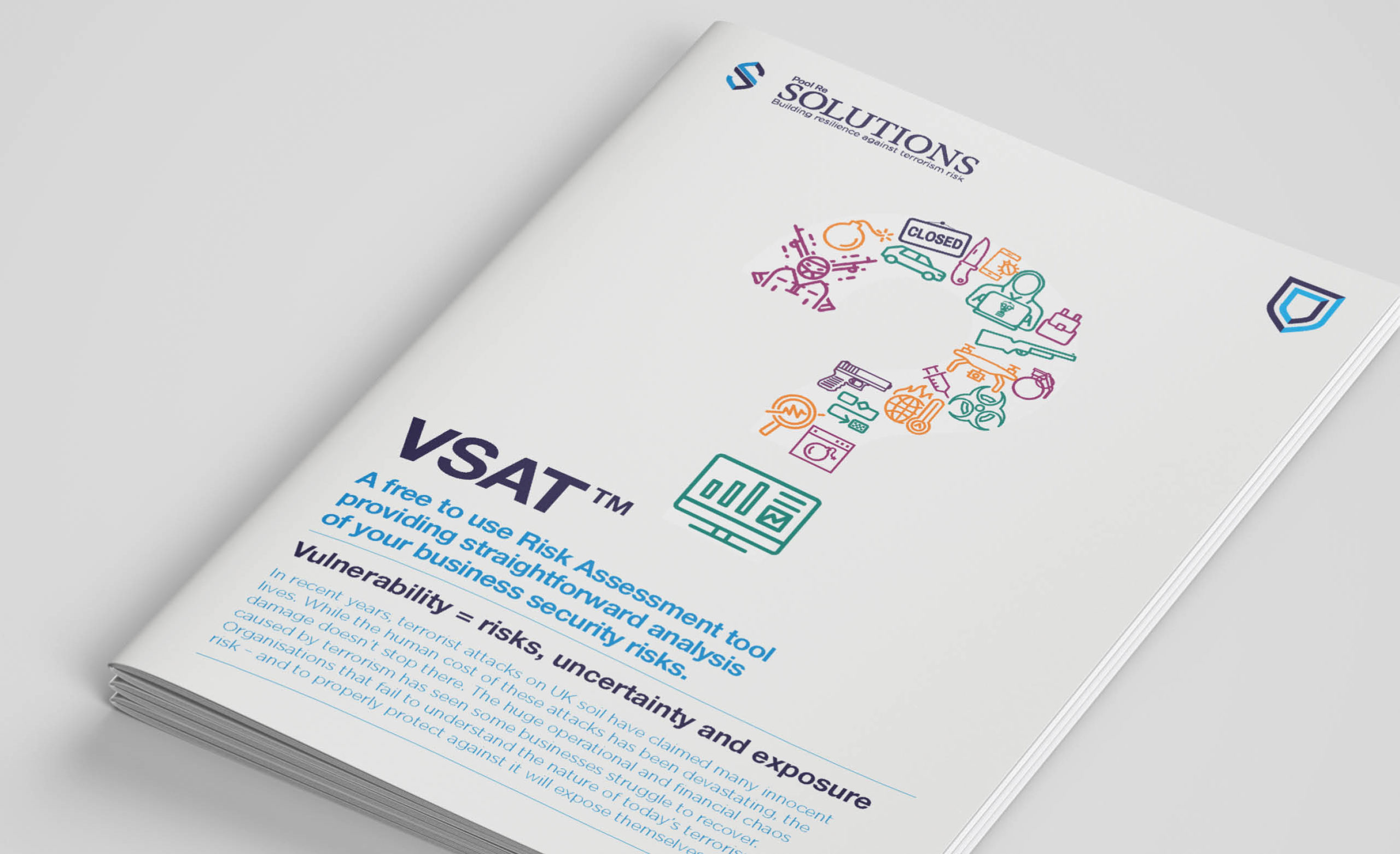
Terrorism changes in ways that natural catastrophe perils cannot, and this presents unique challenges. The threat is no longer confined to bombs, it now includes chemical and biological techniques, drones, cyber, vehicles or knives. In order to reflect this the organisation has undergone an incredible transformation throughout the past five years, closing protection gaps, increasing cover, investing significantly in terrorism threat research and analytics, risk management tools and the most up-to-date bomb blast modelling. They have combined these specialist teams into a new division called SOLUTIONS.
This transformative evolution was the catalyst for Pool Re to ask us to develop their brand, refreshing it to reflect their aspirations to be recognised as the UK’s leading experts in terrorism risk.
Defining the brand proposition
Before you can tell the world why it is you do what you do, you need to first know why. Once this is known, foundations for the brand can be defined that will inform the visual identity.
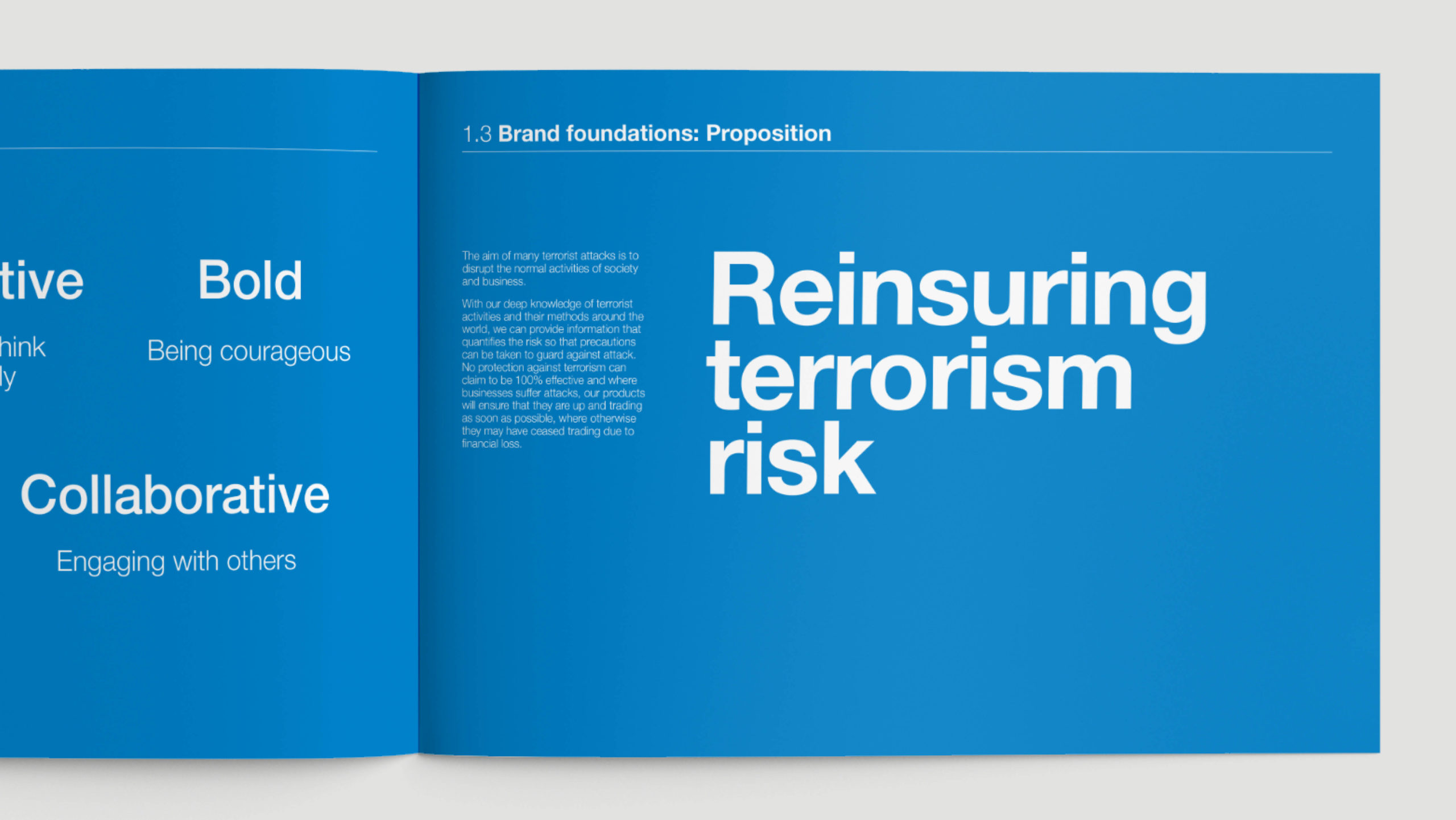
Think
We began by really getting under the skin of the organisation. One way in which we initiated this was with a brand workshop where we explored why the organisation exists, and how far the brand can be pushed to reflect this. Then having defined the refreshed Pool Re brand in the foundations document, we had a benchmark against which the creative work could be scrutinised.
Design
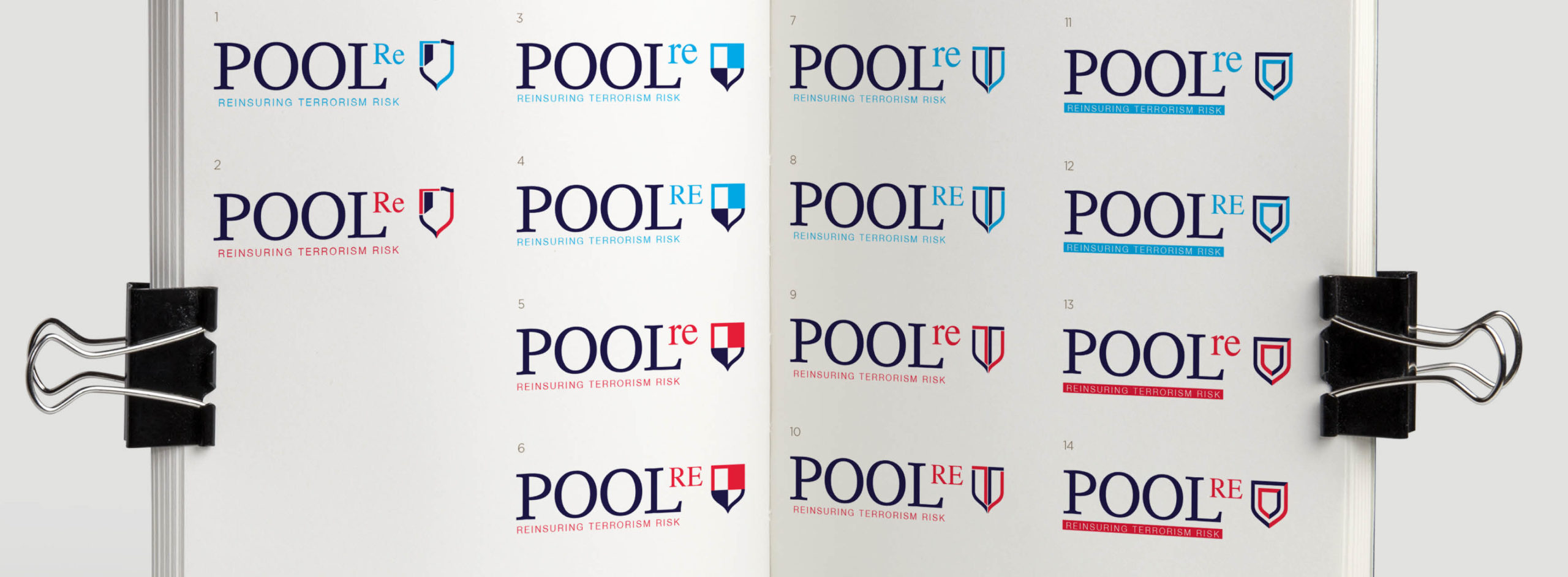
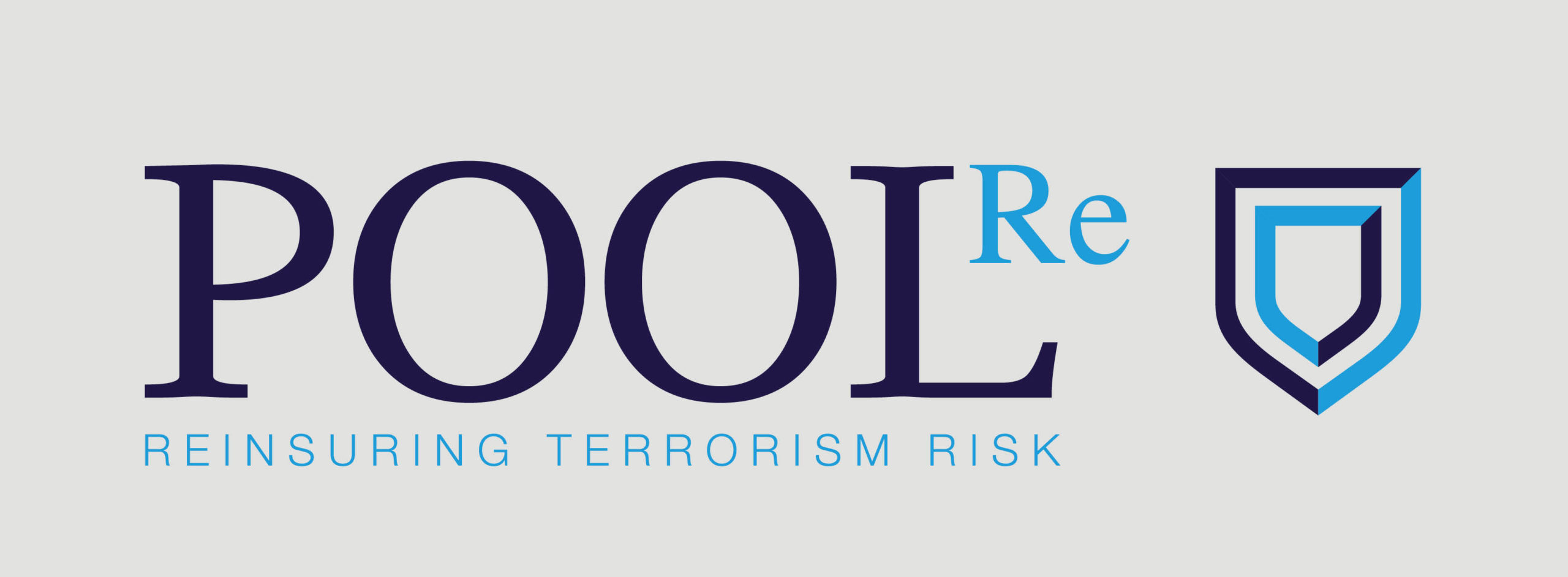
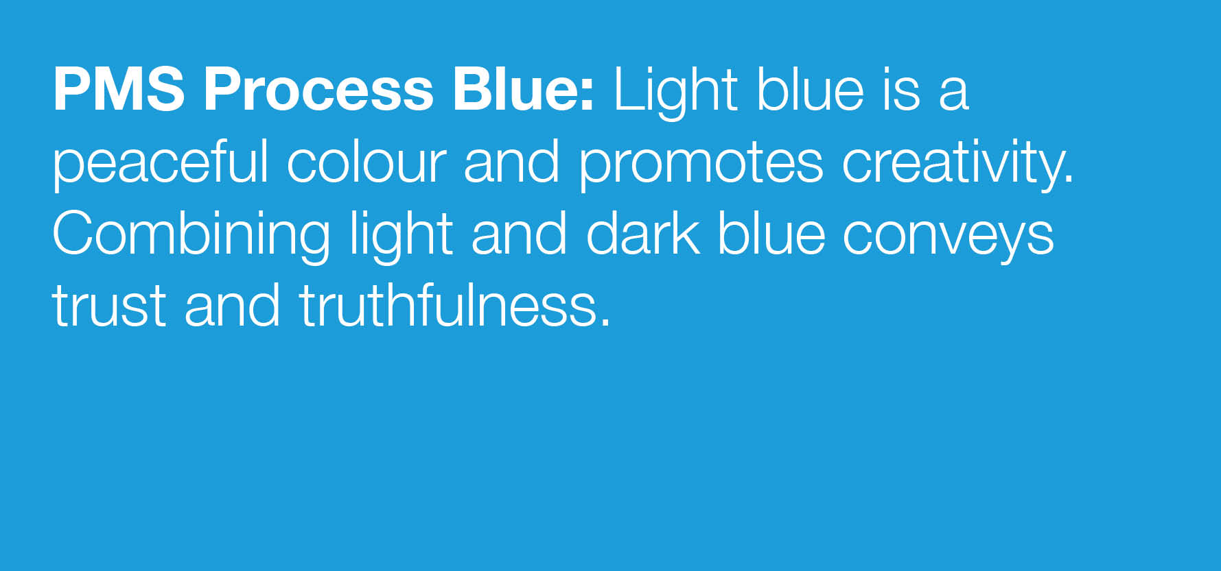
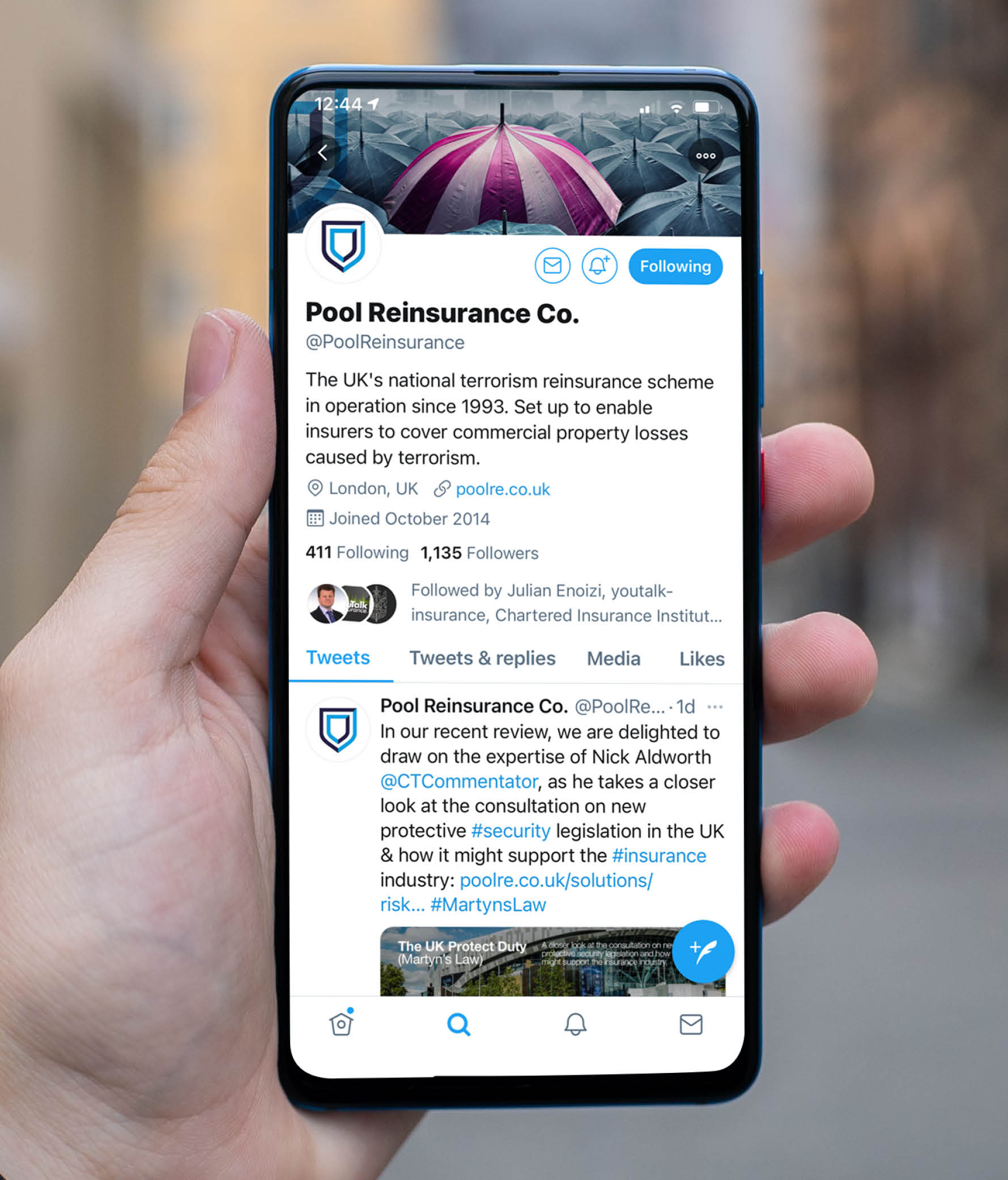
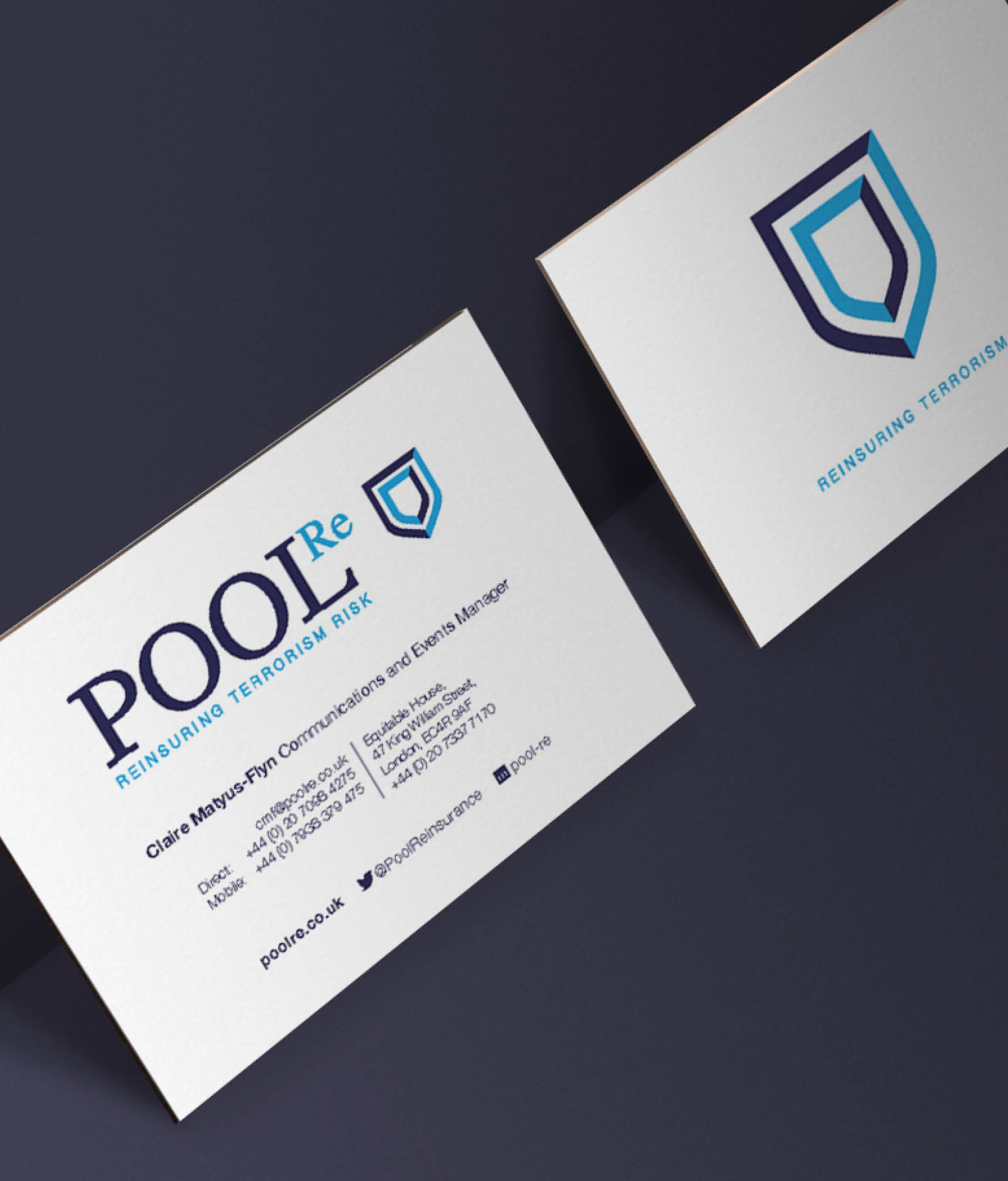
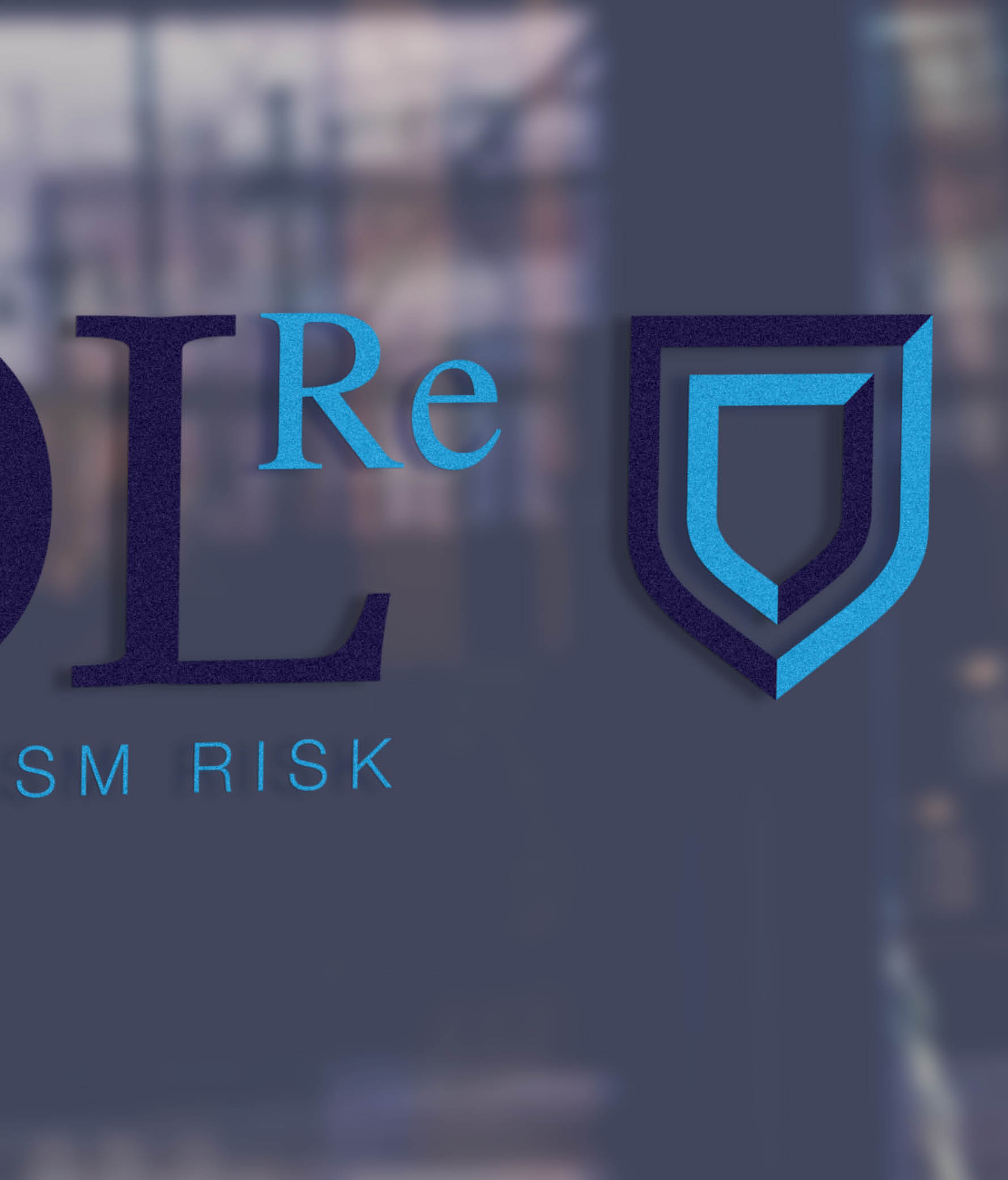
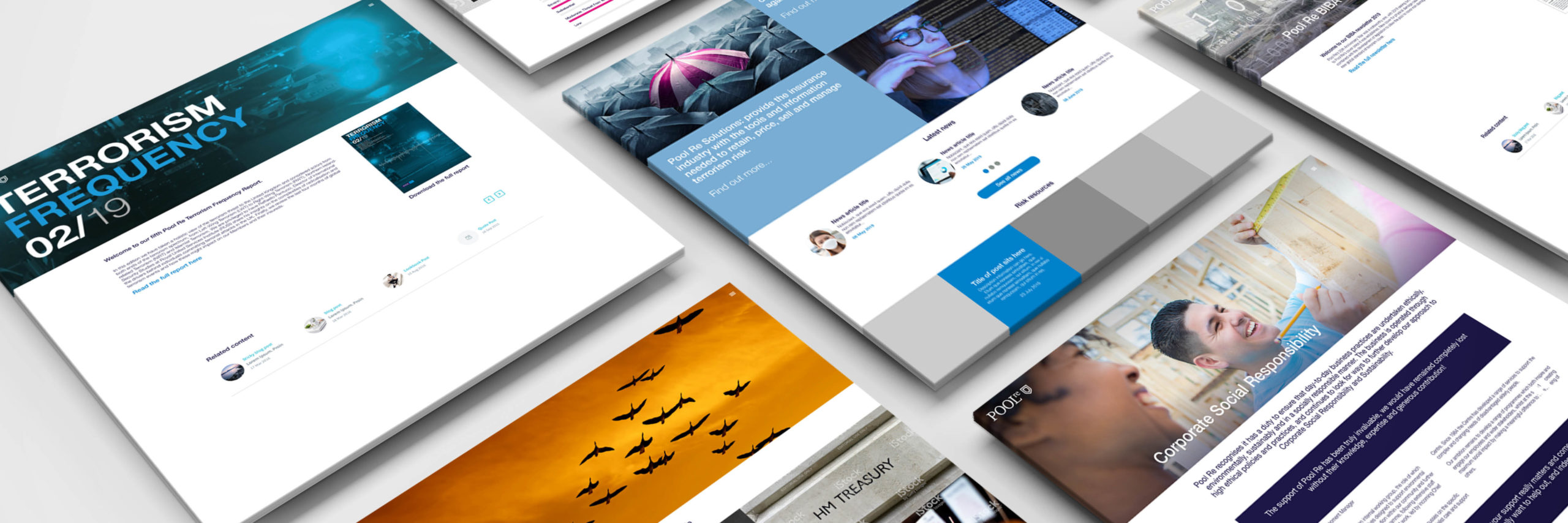
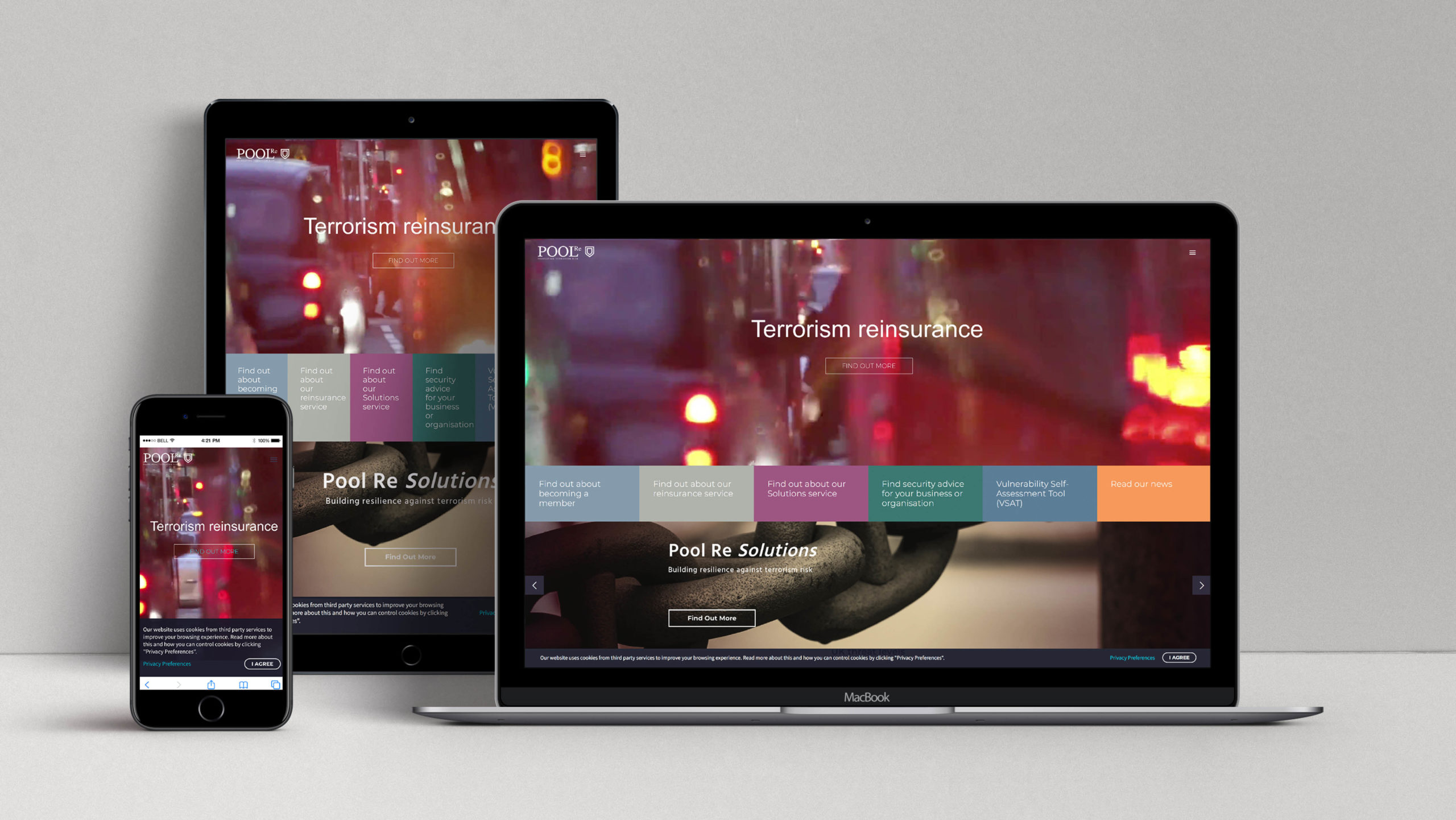
A key requirement of the refresh was that the creativity should reflect a modern progressive organisation while not losing sight of its past. This was achieved in the logo by retaining the typographic style but combining it with a new icon of a shield. The shield was selected for its association with security, strength, protection and defence. We added some energetic colours to the colour palette, a modern sans serif font and engaging imagery. These creative building blocks were applied to designs for all new marketing collateral, which also included the development of a new website.
Create
By this phase of the project we were well underway in creating the necessary marketing resources. We focused on the details ensuring we provided a range of opportunities to Pool Re to expand their resources, such as co-ordinating leaflets, brochures and PowerPoint Templates.
Designing the brand
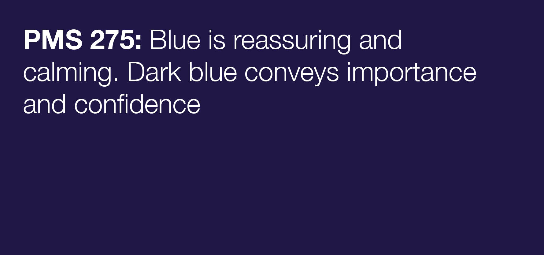
When you know your purpose it is easier to agree upon a symbol that helps the world understand. As individuals we are all moved by colour, so using the right shades is important in getting the right response.

Identifying sub brands
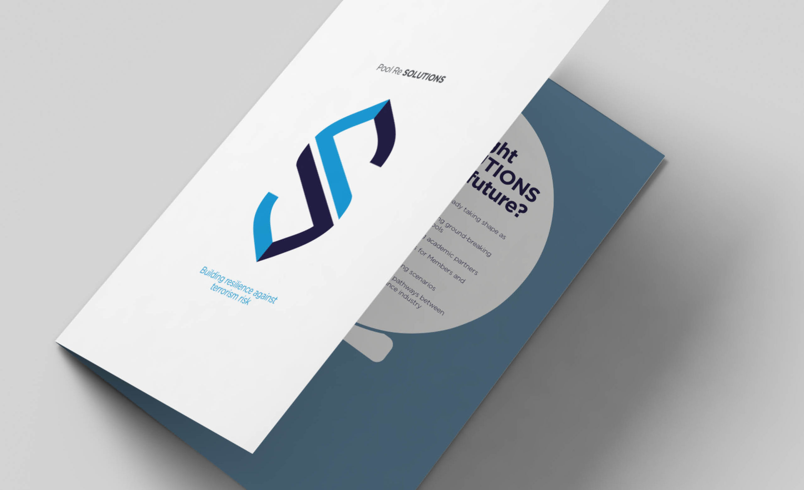
Many organisations have services they want to raise above others – often referred to as sub brands. What is key is to do this in a way that does not undermine the brand as a whole and that also ensures your customers can understand the whole.
Outcome
Our work with Pool Re formed part of the start of a new journey in their evolution, creating a brand with an identity and strong visual language that reflects their aspirations for the future. As the organisation looks ahead, developing new services, helping to inform and drive the future of reinsurance they required an identity that supported these goals being clear, informative whilst providing a sense of calm authority.
![]()
“Cohesion’s organised and disciplined approach lead our company through a major brand overhaul and new website easily and without complication. We had high expectations for the visual look of our new brand and the functionality of our new website, and they met and exceeded our expectations. We have received a range of compliments regarding the coherence of the brand and functionality, accessibility & design of our new website. We are well placed as we move forward as an organisation and look forward to continue to work with Cohesion in the near future on other projects.”
Claire Matyus-Flynn
Head of Marketing and Events, Pool Reinsurance