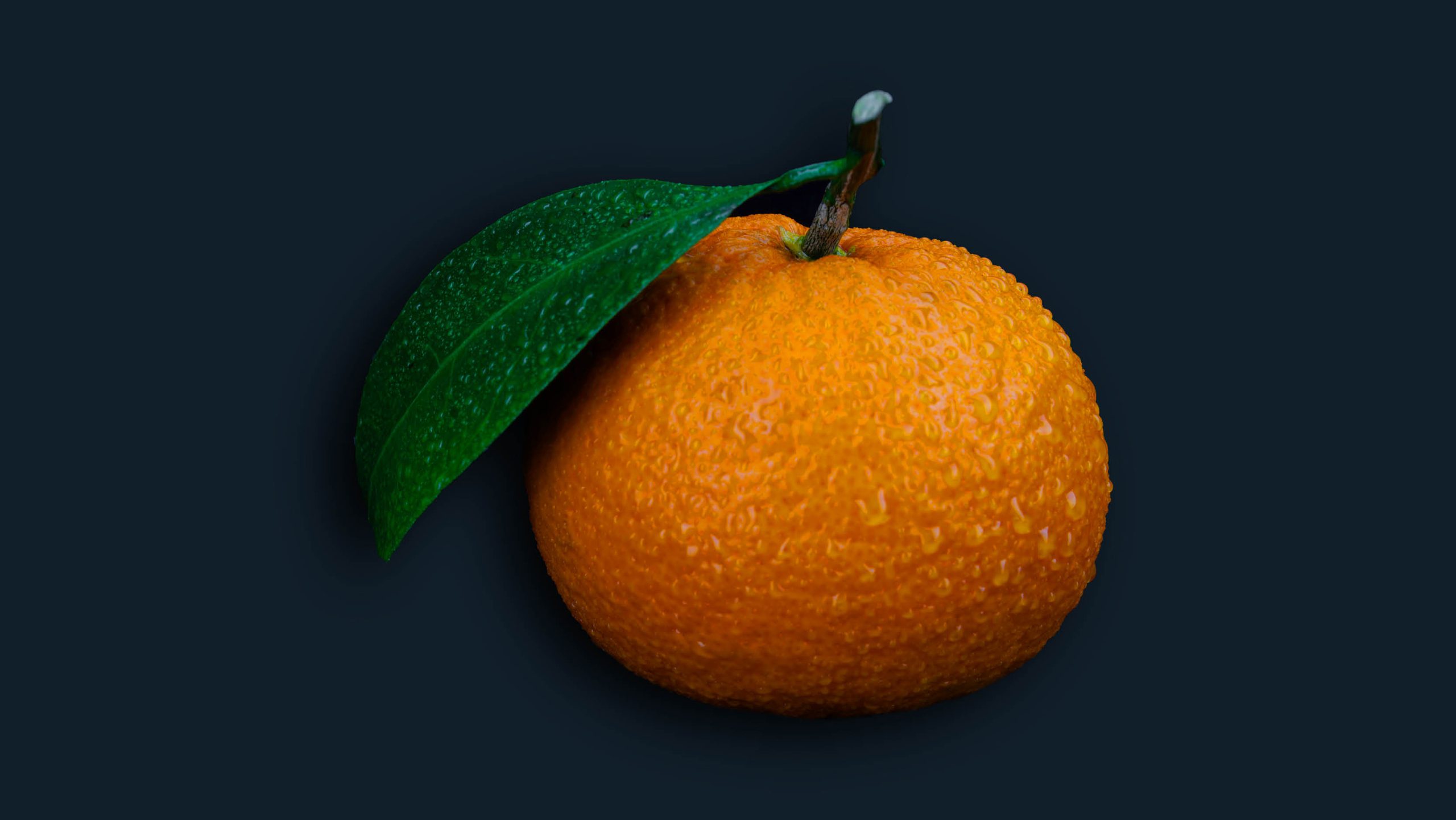
Orange is the “happy” colour par excellence.
It frees emotions, promotes self-esteem and the capacity to forgive. This stimulating colour fights depression and cultivates good humour. Lighter hues such as peach and apricot, help restore nervous energy. Psychologically speaking, colour therapists claim that orange is supposed to shore up the immune system and stimulate digestion.
Those who often wear orange are active, competent and rather impatient. They are independent, motivated, competitive and well organised. They are also creative and practical people, full of energy and often incapable to stay put.
We associate orange with autumn colours, fire, earth and pottery. Despite that, orange does not evoke the same strong symbolic connotations as its immediate neighbours on the colour spectrum, namely yellow and red. It is variously considered joyful and stimulating like yellow or teeming with the passion and buoyancy of red, although always to a lesser degree.
Orange gives the sensation of heat, without the aggression of red. When viewed, it’s been known to increase oxygen supply to the brain and stimulate mental activity. It is also a highly accepted colour amongst younger people, which is why it’s used so often in marketing towards children. Being such a strong colour with high visibility; orange is great for promoting and highlighting certain aspects of design.
There are few symbolic associations cultures have developed with orange. In fact, we talk of red fish and red clay when it would be more accurate to describe them as orange, yet another proof of the secondary role of orange.
Although orange has not achieved a strong symbolic status, it remains an important colour in matters of safety, when good visibility is a must. Known for its high visual impact, orange is used in the manufacturing of a number of safety-related items such as life jackets, buoys and life rafts.
The colour orange is often called the “social” colour, as it creates the feng shui energy to promote lively conversations and good times in your home. In the winter especially it reminds us of summer, as well as resembling the cheerful flickering of deep and vibrant orange in the log fires.
Combining the energy of red with the happiness of yellow, orange is representative of joy, sunshine, health, tropics, creativity, success, stimulation, strength, youth, endurance, autumn, harvest, Halloween and citrus. Orange is required to stimulate sensuality and passion, vitality, optimism and enthusiasm, tolerance and hospitality. In colour therapy it affects the reproductive organs, genitals, gonads, prostate and spleen.
Orange is made up of red and yellow and can represent attributes from each of those colours. Orange is less intense than red but still packs a lot of punch. It is more playful and youthful than red. You can commonly find it used in logos to create a playfulness or stimulate emotions and even appetites.
Orange is a perfect colour choice for Nickelodeon who’s target audience is children. Orange is fun, lighthearted and youthful which reflects the TV channel’s programming. The design of the Nickelodeon logo supports the youthful theme with the paint spattered backdrop and playful typography.